Components
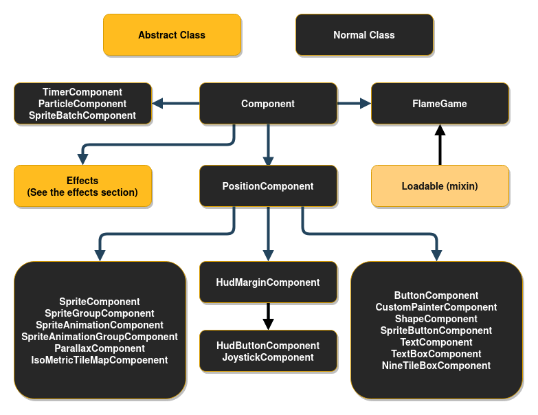
This diagram might look intimidating, but don’t worry, it is not as complex as it looks.
Component
All components inherit from the abstract class Component and all components can have other
Components as children. This is the base of what we call the Flame Component System, or FCS for
short.
Children can be added either with the add(Component c) method or directly in the constructor.
Example:
void main() {
  final component1 = Component(children: [Component(), Component()]);
  final component2 = Component();
  component2.add(Component());
  component2.addAll([Component(), Component()]);
}
The Component() here could of course be any subclass of Component.
Every Component has a few methods that you can optionally implement, which are used by the
FlameGame class.
Component lifecycle
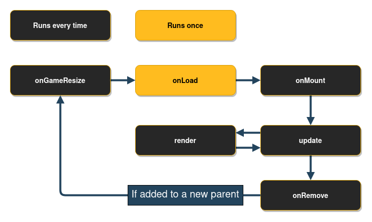
The onGameResize method is called whenever the screen is resized, and once in the beginning when
the component is added to the game via the add method.
The onRemove method can be overridden to run code before the component is removed from the game,
it is only run once even if the component is removed both by using the parents remove method and
the Component remove method.
The onLoad method can be overridden to run asynchronous initialization code for the component,
like loading an image for example. This method is executed after onGameResize, but before
onMount. This method is guaranteed to execute only once during the lifetime of the component, so
you can think of it as an “asynchronous constructor”.
The onMount method runs every time when the component is mounted into a game tree. This means that
you should not initialize late final variables here, since this method might run several times
throughout the component’s lifetime. This method will only run if the parent is already mounted.
If the parent is not mounted yet, then this method will wait in a queue (this will have no effect
on the rest of the game engine).
A component lifecycle state can be checked by a series of getters:
isLoaded: Returns a bool with the current loaded stateloaded: Returns a future that will complete once the component has finished loadingisMounted: Returns a bool with the current mounted statemounted: Returns a future that will complete once the component has finished mounting
Priority
In Flame the order components are rendered (and updated) in is called priority, this is sometimes
referred to as z-index in other languages and frameworks. The higher the priority is set to, the
closer the component will appear on the screen, since it will be rendered on top of any components
with lower priority that were rendered before it.
If you add two components and set one of them to priority 1 for example, then that component will be rendered on top of the other component (if they overlap), because the default priority is 0.
All components take in priority as a named argument, so if you know the priority that you want
your component at compile time, then you can pass it in to the constructor.
Example:
class MyGame extends FlameGame {
  @override
  Future<void> onLoad() {
    final myComponent = PositionComponent(priority: 5);
    add(myComponent);
  }
}
To update the priority of a component you have to either just set it to a new value, like
component.priority = 2, and it will be updated in the next tick.
Example:
class MyComponent extends PositionComponent with Tappable {

  MyComponent() : super(priority: 1);

  @override
  void onTap() {
    priority = 2;
  }
}
In the example above we first initialize the component with priority 1, and then when the user taps the component we change the priority to 2.
Composability of components
Sometimes it is useful to wrap other components inside of your component. For example by grouping
visual components through a hierarchy. You can do this by adding child components to any component,
for example PositionComponent.
When you have child components on a component every time the parent is updated and rendered, all the children are rendered and updated with the same conditions.
Example of usage, where visibility of two components are handled by a wrapper:
class GameOverPanel extends PositionComponent with HasGameRef<MyGame> {
  bool visible = false;
  final Image spriteImage;

  GameOverPanel(this.spriteImage);

  @override
  Future<void> onLoad() async {
    final gameOverText = GameOverText(spriteImage); // GameOverText is a Component
    final gameOverButton = GameOverButton(spriteImage); // GameOverRestart is a SpriteComponent

    add(gameOverText);
    add(gameOverButton);
  }

  @override
  void render(Canvas canvas) {
    if (visible) {
    } // If not visible none of the children will be rendered
  }
}
There are two methods for adding children components to your component. First,
you have methods add(), addAll(), and addToParent(), which can be used
at any time during the game. Traditionally, children will be created and added
from the component’s onLoad() method, but it is also common to add new
children during the course of the game.
The second method is to use the children: parameter in the component’s
constructor. This approach more closely resembles the standard Flutter API:
class MyGame extends FlameGame {
  @override
  Future<void> onLoad() async {
    add(
      PositionComponent(
        position: Vector2(30, 0),
        children: [
          HighScoreDisplay(),
          HitPointsDisplay(),
          FpsComponent(),
        ],
      ),
    );
  }
}
The two approaches can be combined freely: the children specified within the constructor will be added first, and then any additional child components after.
Note that the children added via either methods are only guaranteed to be available eventually: after they are loaded and mounted. We can only assure that they will appear in the children list in the same order as they were scheduled for addition.
Ensuring a component has a given parent
When a component requires to be added to a specific parent type the
ParentIsA mixin can be used to enforce a strongly typed parent.
Example:
class MyComponent extends Component with ParentIsA<MyParentComponent> {
  @override
  Future<void> onLoad() async {
    // parent is of type MyParentComponent
    print(parent.myValue);
  }
}
If you try to add MyComponent to a parent that is not MyParentComponent,
an assertion error will be thrown.
Ensuring a component has a given ancestor
When a component requires to have a specific ancestor type somewhere in the
component tree, HasAncestor mixin can be used to enforce that relationship.
The mixin exposes the ancestor field that will be of the given type.
Example:
class MyComponent extends Component with HasAncestor<MyAncestorComponent> {
  @override
  Future<void> onLoad() async {
    // ancestor is of type MyAncestorComponent.
    print(ancestor.myValue);
  }
}
If you try to add MyComponent to a tree that does not contain MyAncestorComponent,
an assertion error will be thrown.
Querying child components
The children that have been added to a component live in a QueryableOrderedSet called
children. To query for a specific type of components in the set, the query<T>() function can be
used. By default strictMode is false in the children set, but if you set it to true, then the
queries will have to be registered with children.register before a query can be used.
If you know in compile time that you later will run a query of a specific type it is recommended to
register the query, no matter if the strictMode is set to true or false, since there are some
performance benefits to gain from it. The register call is usually done in onLoad.
Example:
@override
Future<void> onLoad() async {
  children.register<PositionComponent>();
}
In the example above a query is registered for PositionComponents, and an example of how to query
the registered component type can be seen below.
@override
void update(double dt) {
  final allPositionComponents = children.query<PositionComponent>();
}
Querying components at a specific point on the screen
The method componentsAtPoint() allows you to check which components were rendered at some point
on the screen. The returned value is an iterable of components, but you can also obtain the
coordinates of the initial point in each component’s local coordinate space by providing a writable
List<Vector2> as a second parameter.
The iterable retrieves the components in the front-to-back order, i.e. first the components in the front, followed by the components in the back.
This method can only return components that implement the method containsLocalPoint(). The
PositionComponent (which is the base class for many components in Flame) provides such an
implementation. However, if you’re defining a custom class that derives from Component, you’d have
to implement the containsLocalPoint() method yourself.
Here is an example of how componentsAtPoint() can be used:
void onDragUpdate(DragUpdateInfo info) {
  game.componentsAtPoint(info.widget).forEach((component) {
    if (component is DropTarget) {
      component.highlight();
    }
  });
}
PositionType
If you want to create a HUD (Head-up display) or another component that isn’t positioned in relation
to the game coordinates, you can change the PositionType of the component.
The default PositionType is positionType = PositionType.game and that can be changed to
either PositionType.viewport or PositionType.widget depending on how you want to position
the component.
PositionType.game(Default) - Respects camera and viewport.PositionType.viewport- Respects viewport only (ignores camera).PositionType.widget- Position in relation to the coordinate system of the Flutter game widget (i.e. the raw canvas).
Most of your components will probably be positioned according to PositionType.game, since you
want them to respect the Camera and the Viewport. But quite often you want for example buttons
and text to always show on the screen, no matter if you move the camera, then you want to use
PositionType.viewport. In some rare cases you want to use PositionType.widget to position
your widgets, when you don’t want the component to respect the camera nor the viewport; this could
for example be for controls or joysticks that would be unergonomic to use if they had to stay within
the viewport.
Do note that this setting is only respected if the component is added directly to the root
FlameGame and not as a child component of another component.
PositionComponent
This class represent a positioned object on the screen, being a floating rectangle or a rotating sprite. It can also represent a group of positioned components if children are added to it.
The base of the PositionComponent is that it has a position, size, scale, angle and
anchor which transforms how the component is rendered.
Position
The position is just a Vector2 which represents the position of the component’s anchor in
relation to its parent; if the parent is a FlameGame, it is in relation to the viewport.
Size
The size of the component when the zoom level of the camera is 1.0 (no zoom, default).
The size is not in relation to the parent of the component.
Scale
The scale is how much the component and its children should be scaled. Since it is represented
by a Vector2, you can scale in a uniform way by changing x and y with the same amount, or in a
non-uniform way, by change x or y by different amounts.
Angle
The angle is the rotation angle around the anchor, represented as a double in radians. It is
relative to the parent’s angle.
Anchor
The anchor is where on the component that the position and rotation should be defined from (the
default is Anchor.topLeft). So if you have the anchor set as Anchor.center the component’s
position on the screen will be in the center of the component and if an angle is applied, it is
rotated around the anchor, so in this case around the center of the component. You can think of it
as the point within the component by which Flame “grabs” it.
PositionComponent children
All children of the PositionComponent will be transformed in relation to the parent, which means
that the position, angle and scale will be relative to the parents state.
So if you, for example, wanted to position a child 50 logical pixels above the center of the parent
you would do this:
Future<void> onLoad() async {
  final parent = PositionComponent(
    position: Vector2(100, 100),
    size: Vector2(100, 100),
    anchor: Anchor.center,
  );
  final child = PositionComponent(position: Vector2(0, -50));
  await parent.add(child);
}
Remember that most components that are rendered on the screen are PositionComponents, so
this pattern can be used in for example SpriteComponent and SpriteAnimationComponent too.
Render PositionComponent
When implementing the render method for a component that extends PositionComponent remember to
render from the top left corner (0.0). Your render method should not handle where on the screen your
component should be rendered. To handle where and how your component should be rendered use the
position, angle and anchor properties and Flame will automatically handle the rest for you.
If you want to know where on the screen the bounding box of the component is you can use the
toRect method.
In the event that you want to change the direction of your components rendering, you can also use
flipHorizontally() and flipVertically() to flip anything drawn to canvas during
render(Canvas canvas), around the anchor point. These methods are available on all
PositionComponent objects, and are especially useful on SpriteComponent and
SpriteAnimationComponent.
In case you want to flip a component around its center without having to change the anchor to
Anchor.center, you can use flipHorizontallyAroundCenter() and flipVerticallyAroundCenter().
SpriteComponent
The most commonly used implementation of PositionComponent is SpriteComponent, and it can be
created with a Sprite:
import 'package:flame/components/component.dart';

class MyGame extends FlameGame {
  late final SpriteComponent player;

  @override
  Future<void> onLoad() async {
    final sprite = await Sprite.load('player.png');
    final size = Vector2.all(128.0);
    final player = SpriteComponent(size: size, sprite: sprite);

    // screen coordinates
    player.position = ... // Vector2(0.0, 0.0) by default, can also be set in the constructor
    player.angle = ... // 0 by default, can also be set in the constructor
    add(player); // Adds the component
  }
}
SpriteAnimationComponent
This class is used to represent a Component that has sprites that run in a single cyclic animation.
This will create a simple three frame animation using 3 different images:
final sprites = [0, 1, 2]
    .map((i) => Sprite.load('player_$i.png'));
final animation = SpriteAnimation.spriteList(
  await Future.wait(sprites),
  stepTime: 0.01,
);
this.player = SpriteAnimationComponent(
  animation: animation,
  size: Vector2.all(64.0),
);
If you have a sprite sheet, you can use the sequenced constructor from the SpriteAnimationData
class (check more details on Images > Animation):
final size = Vector2.all(64.0);
final data = SpriteAnimationData.sequenced(
  textureSize: size,
  amount: 2,
  stepTime: 0.1,
);
this.player = SpriteAnimationComponent.fromFrameData(
  await images.load('player.png'),
  data,
);
If you are not using FlameGame, don’t forget this component needs to be updated, because the
animation object needs to be ticked to move the frames.
To listen when the animation is done (when it reaches the last frame and is not looping) you can
use animation.completed.
Example:
await animation.completed;

doSomething();

// or alternatively

animation.completed.whenComplete(doSomething);
Additionally, this component also has the following optional event callbacks: onStart, onFrame,
and onComplete. To listen to these events, you can do the following:
final animation =
    SpriteAnimation.spriteList([sprite], stepTime: 1, loop: false)
      ..onStart = () {
        // Do something on start.
      };

final animation =
    SpriteAnimation.spriteList([sprite], stepTime: 1, loop: false)
      ..onComplete = () {
        // Do something on completion.
      };

final animation =
    SpriteAnimation.spriteList([sprite], stepTime: 1, loop: false)
      ..onFrame = (index) {
        if (index == 1) {
          // Do something for the second frame.
        }
      };
SpriteAnimationGroup
SpriteAnimationGroupComponent is a simple wrapper around SpriteAnimationComponent which enables
your component to hold several animations and change the current playing animation at runtime. Since
this component is just a wrapper, the event listeners can be implemented as described in
SpriteAnimationComponent.
Its use is very similar to the SpriteAnimationComponent but instead of being initialized with a
single animation, this component receives a Map of a generic type T as key and a
SpriteAnimation as value, and the current animation.
Example:
enum RobotState {
  idle,
  running,
}

final running = await loadSpriteAnimation(/* omitted */);
final idle = await loadSpriteAnimation(/* omitted */);

final robot = SpriteAnimationGroupComponent<RobotState>(
  animations: {
    RobotState.running: running,
    RobotState.idle: idle,
  },
  current: RobotState.idle,
);

// Changes current animation to "running"
robot.current = RobotState.running;
SpriteGroup
SpriteGroupComponent is pretty similar to its animation counterpart, but especially for sprites.
Example:
class ButtonComponent extends SpriteGroupComponent<ButtonState>
    with HasGameRef<SpriteGroupExample>, Tappable {
  @override
  Future<void>? onLoad() async {
    final pressedSprite = await gameRef.loadSprite(/* omitted */);
    final unpressedSprite = await gameRef.loadSprite(/* omitted /*);

    sprites = {
      ButtonState.pressed: pressedSprite,
      ButtonState.unpressed: unpressedSprite,
    };

    current = ButtonState.unpressed;
  }

  // tap methods handler omitted...
}
SvgComponent
Note: To use SVG with Flame, use the flame_svg
package.
This component uses an instance of Svg class to represent a Component that has a svg that is
rendered in the game:
final svg = await Svg.load('android.svg');
final android = SvgComponent.fromSvg(
  svg,
  position: Vector2.all(100),
  size: Vector2.all(100),
);
FlareActorComponent
Note: The previous implementation of a Flare integration API using FlareAnimation and
FlareComponent has been deprecated.
To use Flare within Flame, use the flame_flare
package.
This is the interface for using a flare animation within
flame. FlareActorComponent has almost the same API as of flare’s FlareActor widget. It receives
the animation filename (that is loaded by default with Flame.bundle), it can also receive a
FlareController that can play multiple animations and control nodes.
import 'package:flame_flare/flame_flare.dart';

class YourFlareController extends FlareControls {

  late ActorNode rightHandNode;

  void initialize(FlutterActorArtboard artboard) {
    super.initialize(artboard);

    // get flare node
    rightHand = artboard.getNode('right_hand');
  }
}

final fileName = 'assets/george_washington.flr';
final size = Vector2(1776, 1804);
final controller = YourFlareController();

FlareActorComponent flareAnimation = FlareActorComponent(
  fileName,
  controller: controller,
  width: 306,
  height: 228,
);

flareAnimation.x = 50;
flareAnimation.y = 240;
add(flareAnimation);

// to play an animation
controller.play('rise_up');

// you can add another animation to play at the same time
controller.play('close_door_way_out');

// also, you can get a flare node and modify it
controller.rightHandNode.rotation = math.pi;
You can also change the current playing animation by using the updateAnimation method.
For a working example, check the example in the flame_flare repository.
ParallaxComponent
This Component can be used to render backgrounds with a depth feeling by drawing several
transparent images on top of each other, where each image or animation (ParallaxRenderer) is
moving with a different velocity.
The rationale is that when you look at the horizon and moving, closer objects seem to move faster than distant ones.
This component simulates this effect, making a more realistic background effect.
The simplest ParallaxComponent is created like this:
@override
Future<void> onLoad() async {
  final parallaxComponent = await loadParallaxComponent([
    ParallaxImageData('bg.png'),
    ParallaxImageData('trees.png'),
  ]);
  add(parallaxComponent);
}
A ParallaxComponent can also “load itself” by implementing the onLoad method:
class MyParallaxComponent extends ParallaxComponent<MyGame> {
  @override
  Future<void> onLoad() async {
    parallax = await gameRef.loadParallax([
      ParallaxImageData('bg.png'),
      ParallaxImageData('trees.png'),
    ]);
  }
}

class MyGame extends FlameGame {
  @override
  Future<void> onLoad() async {
    add(MyParallaxComponent());
  }
}
This creates a static background. If you want a moving parallax (which is the whole point of a parallax), you can do it in a few different ways depending on how fine-grained you want to set the settings for each layer.
They simplest way is to set the named optional parameters baseVelocity and
velocityMultiplierDelta in the load helper function. For example if you want to move your
background images along the X-axis with a faster speed the “closer” the image is:
final parallaxComponent = await loadParallaxComponent(
  _dataList,
  baseVelocity: Vector2(20, 0),
  velocityMultiplierDelta: Vector2(1.8, 1.0),
);
You can set the baseSpeed and layerDelta at any time, for example if your character jumps or your game speeds up.
final parallax = parallaxComponent.parallax;
parallax.baseSpeed = Vector2(100, 0);
parallax.velocityMultiplierDelta = Vector2(2.0, 1.0);
By default, the images are aligned to the bottom left, repeated along the X-axis and scaled
proportionally so that the image covers the height of the screen. If you want to change this
behavior, for example if you are not making a side-scrolling game, you can set the repeat,
alignment and fill parameters for each ParallaxRenderer and add them to ParallaxLayers that
you then pass in to the ParallaxComponent’s constructor.
Advanced example:
final images = [
  loadParallaxImage('stars.jpg', repeat: ImageRepeat.repeat, alignment: Alignment.center, fill: LayerFill.width),
  loadParallaxImage('planets.jpg', repeat: ImageRepeat.repeatY, alignment: Alignment.bottomLeft, fill: LayerFill.none),
  loadParallaxImage('dust.jpg', repeat: ImageRepeat.repeatX, alignment: Alignment.topRight, fill: LayerFill.height),
];
final layers = images.map((image) => ParallaxLayer(await image, velocityMultiplier: images.indexOf(image) * 2.0));
final parallaxComponent = ParallaxComponent.fromParallax(
  Parallax(
    await Future.wait(layers),
    baseVelocity: Vector2(50, 0),
  ),
);
The stars image in this example will be repeatedly drawn in both axis, align in the center and be scaled to fill the screen width.
The planets image will be repeated in Y-axis, aligned to the bottom left of the screen and not be scaled.
The dust image will be repeated in X-axis, aligned to the top right and scaled to fill the screen height.
Once you are done setting up your ParallaxComponent, add it to the game like with any other
component (game.add(parallaxComponent).
Also, don’t forget to add you images to the pubspec.yaml file as assets or they wont be found.
The Parallax file contains an extension of the game which adds loadParallax, loadParallaxLayer
, loadParallaxImage and loadParallaxAnimation so that it automatically uses your game’s image
cache instead of the global one. The same goes for the ParallaxComponent file, but that provides
loadParallaxComponent.
If you want a fullscreen ParallaxComponent simply omit the size argument and it will take the
size of the game, it will also resize to fullscreen when the game changes size or orientation.
Flame provides two kinds of ParallaxRenderer: ParallaxImage and ParallaxAnimation,
ParallaxImage is a static image renderer and ParallaxAnimation is, as it’s name implies, an
animation and frame based renderer.
It is also possible to create custom renderers by extending the ParallaxRenderer class.
Three example implementations can be found in the examples directory.
ShapeComponents
A ShapeComponent is the base class for representing a scalable geometrical shape. The shapes have
different ways of defining how they look, but they all have a size and angle that can be modified
and the shape definition will scale or rotate the shape accordingly.
These shapes are meant as a tool for using geometrical shapes in a more general way than together with the collision detection system, where you want to use the ShapeHitboxes.
PolygonComponent
A PolygonComponent is created by giving it a list of points in the constructor, called vertices.
This list will be transformed into a polygon with a size, which can still be scaled and rotated.
For example, this would create a square going from (50, 50) to (100, 100), with it’s center in (75, 75):
void main() {
  PolygonComponent([
    Vector2(100, 100),
    Vector2(100, 50),
    Vector2(50, 50),
    Vector2(50, 100),
  ]);
}
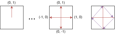
A PolygonComponent can also be created with a list of relative vertices, which are points defined
in relation to the given size, most often the size of the intended parent.
For example you could create a diamond shapes polygon like this:
void main() {
  PolygonComponent.relative(
    [
      Vector2(0.0, 1.0), // Middle of top wall
      Vector2(1.0, 0.0), // Middle of right wall
      Vector2(0.0, -1.0), // Middle of bottom wall
      Vector2(-1.0, 0.0), // Middle of left wall
    ],
    size: Vector2.all(100),
  );
}
The vertices in the example defines percentages of the length from the center to the edge of the
screen in both x and y axis, so for our first item in our list (Vector2(0.0, 1.0)) we are pointing
on the middle of the top wall of the bounding box, since the coordinate system here is defined from
the center of the polygon.
In the image you can see how the polygon shape formed by the purple arrows is defined by the red arrows.
Remember to define the lists in a counter clockwise manner (if you think in the screen coordinate system where the y-axis is flipped, otherwise it is clockwise).
RectangleComponent
A RectangleComponent is created very similarly to how a PositionComponent is created, since it
also has a bounding rectangle.
Something like this for example:
void main() {
  RectangleComponent(
    position: Vector2(10.0, 15.0),
    size: Vector2.all(10),
    angle: pi/2,
    anchor: Anchor.center,
  );
}
Dart also already has an excellent way to create rectangles and that class is called Rect, you can
create a Flame RectangleComponent from a Rect by using the Rectangle.fromRect factory, and
just like when setting the vertices of the PolygonComponent, your rectangle will be sized
according to the Rect if you use this constructor.
The following would create a RectangleComponent with its top left corner in (10, 10) and a size
of (100, 50).
void main() {
  RectangleComponent.fromRect(
    Rect.fromLTWH(10, 10, 100, 50),
  );
}
You can also create a RectangleComponent by defining a relation to the intended parent’s size,
you can use the default constructor to build your rectangle from a position, size and angle. The
relation is a vector defined in relation to the parent size, for example a relation that is
Vector2(0.5, 0.8) would create a rectangle that is 50% of the width of the parent’s size and
80% of its height.
In the example below a RectangleComponent of size (25.0, 30.0) positioned at (100, 100) would
be created.
void main() {
  RectangleComponent.relative(
    Vector2(0.5, 1.0),
    position: Vector2.all(100),
    size: Vector2(50, 30),
  );
}
Since a square is a simplified version of a rectangle, there is also a constructor for creating a
square RectangleComponent, the only difference is that the size argument is a double instead
of a Vector2.
void main() {
  RectangleComponent.square(
    position: Vector2.all(100),
    size: 200,
  );
}
CircleComponent
If you know how long your circle’s position and/or how long the radius is going to be from the start
you can use the optional arguments radius and position to set those.
The following would create a CircleComponent with its center in (100, 100) with a radius of 5,
and therefore a size of Vector2(10, 10).
void main() {
  CircleComponent(radius: 5, position: Vector2.all(100), anchor: Anchor.center);
}
When creating a CircleComponent with the relative constructor you can define how long the
radius is in comparison to the shortest edge of the of the bounding box defined by size.
The following example would result in a CircleComponent that defines a circle with a radius of 40
(a diameter of 80).
void main() {
  CircleComponent.relative(0.8, size: Vector2.all(100));
}
TiledComponent
Currently we have a very basic implementation of a Tiled component. This API uses the lib tiled.dart to parse map files and render visible layers.
An example of how to use the API can be found here.
IsometricTileMapComponent
This component allows you to render an isometric map based on a cartesian matrix of blocks and an isometric tileset.
A simple example on how to use it:
// Creates a tileset, the block ids are automatically assigned sequentially starting at 0,
// from left to right and then top to bottom.
final tilesetImage = await images.load('tileset.png');
final tileset = IsometricTileset(tilesetImage, 32);
// Each element is a block id, -1 means nothing
final matrix = [[0, 1, 0], [1, 0, 0], [1, 1, 1]];
add(IsometricTileMapComponent(tileset, matrix));
It also provides methods for converting coordinates so you can handle clicks, hovers, render entities on top of tiles, add a selector, etc.
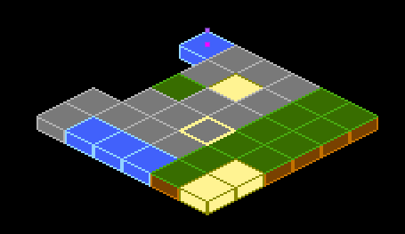
You can also specify the tileHeight, which is the vertical distance between the bottom and top
planes of each cuboid in your tile. Basically, it’s the height of the front-most edge of your
cuboid; normally it’s half (default) or a quarter of the tile size. On the image below you can see
the height colored in the darker tone:

This is an example of how a quarter-length map looks like:
Flame’s Example app contains a more in-depth example, featuring how to parse coordinates to make a selector. The code can be found here, and a live version can be seen here.
NineTileBoxComponent
A Nine Tile Box is a rectangle drawn using a grid sprite.
The grid sprite is a 3x3 grid and with 9 blocks, representing the 4 corners, the 4 sides and the middle.
The corners are drawn at the same size, the sides are stretched on the side direction and the middle is expanded both ways.
Using this, you can get a box/rectangle that expands well to any sizes. This is useful for making panels, dialogs, borders.
Check the example app nine_tile_box for details on how to use it.
CustomPainterComponent
A CustomPainter is a Flutter class used with the CustomPaint widget to render custom
shapes inside a Flutter application.
Flame provides a component that can render a CustomPainter called CustomPainterComponent, it
receives a custom painter and renders it on the game canvas.
This can be used for sharing custom rendering logic between your Flame game, and your Flutter widgets.
Check the example app custom_painter_component for details on how to use it.
Effects
Flame provides a set of effects that can be applied to a certain type of components, these effects can be used to animate some properties of your components, like position or dimensions. You can check the list of those effects here.
Examples of the running effects can be found here;